Showing posts with label Farrow and Ball. Show all posts

Monday, September 16, 2013

GRAY DAY-FARROW AND BALL


It's cloudy and gray today with ominous clouds announcing that rain is on the way, the perfect day to talk about my favorite paint color, gray. I love gray paint--whether it's a soft chalky gray or deep, dark and moody, I always find a room or two that could do with a touch of gray. In my opinion, no one does gray better than Farrow and Ball, the luxury English paint and wallpaper company know for their beautiful, saturated hues and high quality paint. I stopped by the Farrow and Ball Showroom last week to pick up a new color chart and check out their Fall Color Collection which introduced nine new paint hues and included some pretty incredible grays.
My favorite new color is Moles Breath (how can you not love that name!) 
Dark and rich, this color is stunning.  I brought a pot home and am going to paint a set of dining room chairs-finger's crossed, I will let you know how it all turns out.
Wevet, named after the old Dorset term for spider's web, it's a delicate, soft gray.
Dimpse, a cooler, bluer gray is soft and elegant.
Lovely Ammonite was named after the fossils found off the coast of Dorsit.
A warmer gray, Purbeck Stone is a stronger neutral which resembles the stone found in the Isle of Purbeck. 

What's your favorite gray?


Monday, January 24, 2011

SNEAK PEEK: FARROW & BALL 2011

Nine new colors will be introduced by UK based Farrow & Ball in February, but I have a sneak peek for you today. Know for their lush color palette and intense, saturated hues, the nine new colors are a luxurious mix of neutrals with a pop of delicious burnt orange. The new paints join a sophisticated lineup of 132 colors that are eco and user friendly. Looking for a quick design change for 2011?  Pick up a paint brush!

 Oxford Stone No.264
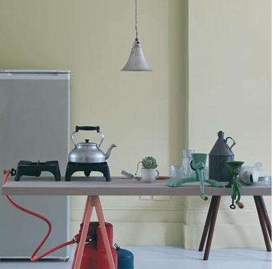
Shown here in the cloth beneath the teapot, this warm neutral was named after the color of the stone used in Oxfordshire village houses.
 Manor House Gray No.265
My favorite new grey, this hue reflects the quintessentially English manor houses of the 18th century. Beautiful in both traditional and more modern designs.


 Mizzle: No. 266 
Named after the West Country description of mist and drizzle-it's a great neutral (and a great name!)
 Dove Tale No.267
A soft grey neutral that works well with a variety of hues.


Charlotte's Locks No.268
A brilliant burst of color, Charlotte's Locks is for those adventurous types. A deep burnt
orange
with a sophisticated flair, use on a mirror frame for a fun pop.
 Plummett No.272
Sophisticated and modern, Plummett is ready to add drama to your decor. This deep grey was named after the lead weight used to sink a fishing line.


 Brassica No. 271 
This delicate violet is perfect with soft grays and whites.
 Calluna No.270 
 Calluna is a soft grey named after the Scottish heather.
 Cabbage White No. 269