Showing posts with label Miles Redd. Show all posts

Wednesday, September 10, 2014

Super Moon-Super Color


Last night's epic Harvest moon, with its bold burst of orange and apricot hues reminds me once again how vital nature is as a inspiration to both fashion and interior design.  

One of my favorite fashion designers, Naeem Khan, channeled a summer sunset in his 2014 Spring collection.
From salmon to cinnabar, you can turn up the volume and make a statement with orange or add subtle peach highlights to a room with the added benefit that the color makes everyone's skin look fabulous!
I'm so enamored with the color that I used Beacon Hills gorgeous Silk Lantern in a showhouse dining room earlier this year. Voluminous ballroom curtains were paired with muted gray for a fresh, modern twist.  
Amanda Nisbet paired her nature inspired tree floor lamp with lush orange curtains.
Katie Ridder's exotic bathroom features an cinnabar hued wallpaper.
A bright orange banquette plays off deep blue lacquered walls in a room by Miles Redd.


Friday, February 1, 2013

NICK OLSEN DESIGNS FOR LEE JOFA

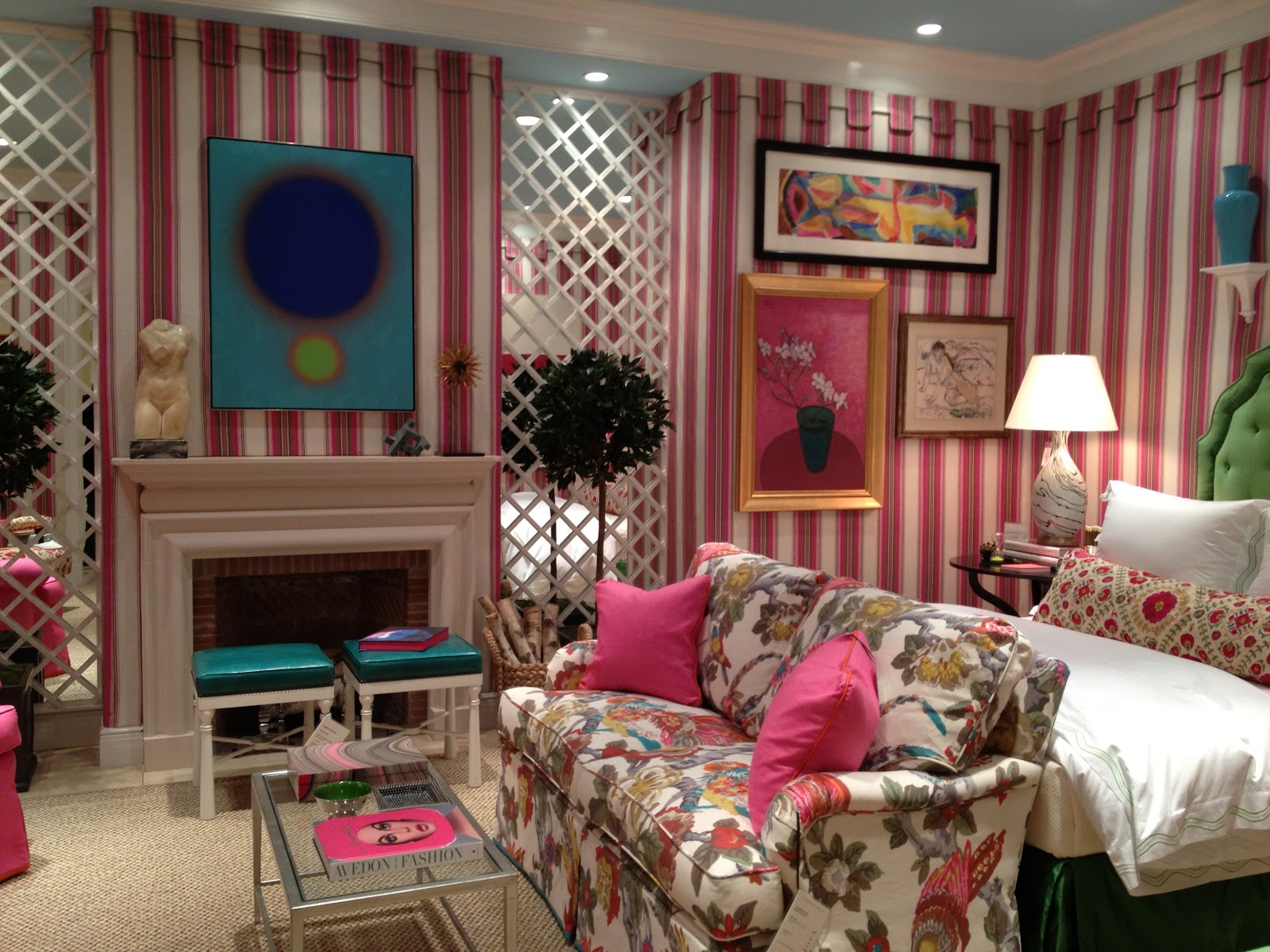
 Bold, jaunty, sophisticated- New York interior designer Nick Olsen's bedroom for the NY showroom of Lee Jofa is full of life. You might remember Olsen from his days as Domino's Deal Hunter and his work with designer Miles Redd, where he obviously honed his cultivated use of color. Here, Olsen takes a preppy pink and green color combination and turns it on its heels--layering deep turquoise and emerald greens with pops of hot pink and raspberry. The walls are cocooned in a playful pink awning stripe which contrasts nicely with an ethereal cloud blue ceiling. The richly layered room is fun and edgy, a stunning bedroom lair!


Monday, January 16, 2012

CHEVRON HERE TO STAY?

Veranda 
The chevron pattern, immortalized by Missoni, has been a strong design trend for several years. The ubiquitous zigzag design is a versatile print that's found its way onto pillows, lamps, rugs and accessories galore. Designer Madeline Weinrib celebrates the print on a popular rug collection, Quadrille's fabulous collection of chevron prints is very sought after and the retailer West Elm carries nearly everything else one would need in a cheeky chevron print. Is the love affair over?  Have we had enough of the saucy stripe?  
Markham Roberts
Gorgeous marble in chevron pattern
Alan Campbell 
Miles Redd
Quadrille
Ariana Bell

Coastal Living
Apartment Therapy
 Personally, I'm still infatuated with the print, especially when it's used as a statement maker, celebrating its bold, brash charm.  How about you? 


Monday, October 24, 2011

SEEING RED


All my life I've pursued the perfect red." -Diana Vreeland

There's something very glamorous about walking into a red room. The warm, vibrant tones immediately make me feel happy and energized. And whether it's a room of cayenne lacquered walls or a peppy ruby red accent pillow, the pop of color adds personality and style to any decor. My favorite design image is the iconic photo of Diana Vreeland snapped by Horst in her lipstick red living room. "I want this place to look like a garden, but a garden in hell," she said. The room, filled with layers of chintz and needlepoint pillows in tulip red is not for the faint of heart!  There are so many gorgeous shades of red to choose from there's sure to be a shade to fit your style. How do you feel about red?

 Tulip red, Paint of Europe, Sangria, Benjamin Moore, Salsa, Benjamin Moore, Ruby Red, Benjamin Moore, Chili Pepper, Benjamin Moore, Million Dollar Red, Benjamin Moore

 Kenneth Jay Lane's Chic Manhattan duplex is saturated in persimmon red
Gallery style art work frames the chic transitional room by Bibi Monahan
 Bold red lacquered kitchen cabinets-do you dare?
Miles Redd brings whimsy and fun to a NYC apartment
Glamorous red lacquered  walls pop with glossy black and white accents by Brian McCarthy

Thursday, May 12, 2011

FOLLOW THE TREND


I'm always curious to hear about the latest Interior Design trends: a return to Baroque, taxidermy in the home; some sound fascinating, others I can't imagine.  Truthfully, I tend to resist trends, knowing that by the time I got around to purchasing just the right cerused oak bureau, knotty oak will be all the rage.  So it was with a keen interest that I attended the Wall Street Journal Magazine Panel Discussion at the D & D Building yesterday on "Whats Next In Decorating?"  The distinguished panel included two of my favorite tastemakers, David Netto and Miles Redd along with Sarah Ruffin Costello and Deborah Needleman of the WSJ Magazine. The panel discussion was lively and touched upon trends, design inspiration and answers to the all important question, "What's Next?"


David Netto's Neutra Home


A Miles Redd Interior

What inspires them right now?
Miles Redd, a true master of color, not surprisingly loves the pairing of daring colors like daffodil yellow and hot pink in a room.  Redd mentioned the late Henri Samuel's Paris apartment with its restrained French elegance as one of his inspirations.  Also, the panel agreed that "design statements"  like a glossy black wall with crisp white trim or a larger than life statue expresses character and personality in a room. Netto referred to the iconic Dorothy Draper and her fearless use of scale and color to produce innovative rooms that are still relevant today. All agreed, a few good things will carry a room and restraint, rather than excess, should be the rule. 


 Henri Samuels Paris Apartment
Dorothy Draper's Iconic Style


Where are we going? 
An appreciation for the handmade: rugs, textiles and furniture will show individual style and admiration for craftsmanship.  Love it or leave it, beige will be replaced with exuberance and color and we will see a departure from the hard lines and stark interiors of the 70's. Look to the 80's for inspiration.  Netto described this design trend as "Messy Modernism", an edited and crisp revision of the 80's interiors of Mario Buatta and Mark Hampton. Think casual chintz in a modern more simplified manner. "Rustic Luxe", the beachy chic of the Grey Gardens variety will also be a popular trend.  


Mario Buatta Interior
 Mark Hampton Interiors

Grey Gardens

I'm a product of the 80"s. My first apartment had girly floral chintz drapes that I absolutely adored and although I can't see myself replicating that look, I believe an edited and streamlined 80's design is something very relatable. I'm excited for what's next-how about you?

Friday, May 14, 2010

KARATE CHOP

 Designer Celerie Kemble does the chop.

Do you karate chop your pillows? In an effort to "fluff up" a pancake thin down pillow, many people resort to the "karate chop"; puffing the pillow and then chopping down the middle leaving a large V indentation.  The karate chop seems to evoke the wrath of some in the design community. In a recent interview, designer Michael Smith said something to the effect that a karate chopped pillow should be punishable by jail time! There is even a Facebook Fan page "Don't you hate it when you karate chop your pillow in half!!" (258 fans).

While I'm not a big fan of the full-blown "chop," I don't think it's an offense that should require jail time. As with most things, moderation seems to produce the best results. A tiny indentation on the top of the pillow leaves a shallow, subtle scoop, producing a fluffy, inviting pillow.  And so, the debate goes on-what do you think of the Karate Chop?

  Super Chop!
Desinger Carlton Varney karate chops his pillows

Modified karate chop from Eric Kohler


and Miles Redd...